BEYOND DATA DISSECTION
LIES VISUAL CLARITY
Hi I’m AMANDA MONZON, an information designer transforming business data chaos into clarity for data driven organizations. Through prototyping and branded report implementations, I create systematic, function-first analytics. My discovery driven approach identifies metrics that matter, delivering purposeful dashboards that accelerate decisions and reduce reporting prep time.
-

Dashboard Templates
Custom style and layout templates using company brand guidelines built in Figma or Tableau.
-

Static Graphic
Visually displaying data points in a chart or graph to convey a message within the data.
-

DataViz Prototypes
Based on objective, build clickable prototype in Figma with style, layout, chart selection ready for engineer to build out.
-

DataViz Project
Starting with objective and desired outcome, to designing layout and style, low to medium data prep, to building interactive dashboard in Tableau.
Portfolio
-

DASHBOARD TEMPLATE
Example of business dashboard showcasing left panel navigation that allows users to select topic and user profile, charts on right will adjust to show the most relevant information.
-

STATIC STORYTELLING
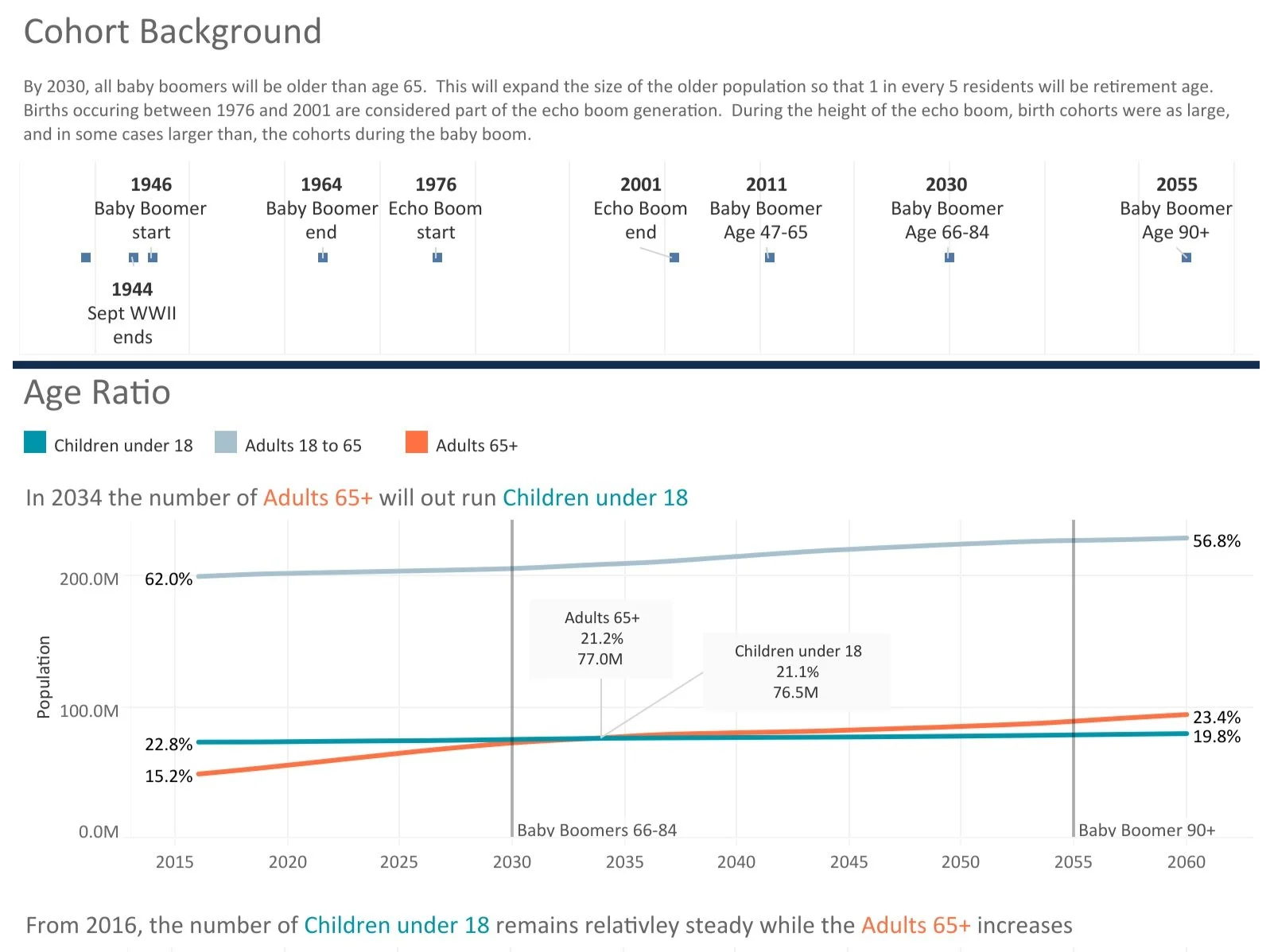
Makeover Monday of US census data, redesigning 1 chart into a series that shows each part of the data and how it gets to the conclusion statement.
-

INTERACTIVE DASHBOARD
Visualizes the journey of Utah's newest professional hockey team, from their Winnipeg roots to their future in Salt Lake City. As a hockey fan, I'm excited to welcome these players to our state and created this interactive visualization to help fellow fans get to know our roster.
Talks & Articles
-
Design Philosopher Substack
Discussing the intersection of design principals with information design.
-
Tableau Conference
Yes You Can Have Data Governance and Self-Service Analytics - good data governance doesn't restrict self-service analytics in the enterprise. Explore the principles of data governance and hear lessons learned from Healthfirst and Vanderbilt University.
-
Medium Towards Data Science
Dates in Tableau - user wants to track how sales are doing to the previous year on a macro and micro level (YTD, Day YOY); 1) switch between date fields, 2) drill up and down, 3) Date Compare
-
NYC Tableau User Group (TUG)
Presented embedding Tableau institutional reports and participated on the hiring panel.
Data Visualization Cycle
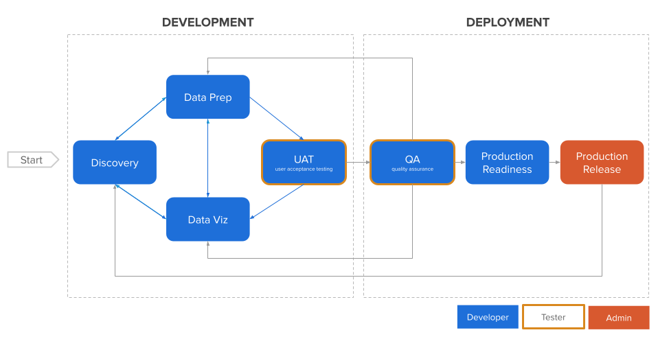
The iterative data visualization creation process is applied to new projects and existing, focusing on quality assurance checks and agile deployment.
Ready for Intuitive Data Visualization?
Email me your project objectives to discover how we can transform your complex data into beautiful, meaningful visual stories that your users will love to explore.
Lets chat
Monzon Design, LLC
Mountain Green, UT


